
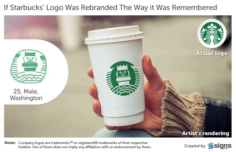
Branded in Memory is an experiment to see how well people recall company logos, proportions and their colors. The results are then tracked on a grid for accuracy and then broken out into additional graphs and charts to show patterns of the inaccuracies.

Check out more logos including Apple and Ikea here. Plus, see the fun of the hand-drawn logos applied to the brand’s products.

Although there is tons of humor here, there is a very important message about the importance of simplicity, repetition and consistency that drives people’s understanding of the brand, the colors, and the images associated with the brand.
Consider all that when you are developing the message for your next experiential project. If people can’t recall the Apple logo correctly even though they see it daily on their phones, then what can you do to guarantee they’ll remember your message after your event?
via Quipsologies
