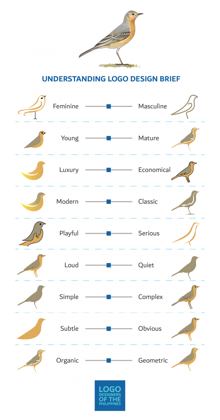
This simple chart from Dubai based designer Jefferson Pascual pairs many common client keywords along a horizontal axis and then provides visual examples to help highlight the differences. While an excellent tool for logo design, keep in mind that all these axes and terms apply across the board in all design fields.
The chart pairs up visual opposites along several axes: masculine/feminine, young/mature, modern/classic.

It is important to note that the chart only covers logo design styles. Many of these axes can also have other design attributes mapped to them. For example, there are certain colors that can easily be placed along the young/mature, loud/quiet and playful/serious axes.
When starting a project, take a chart like this and mark up where the client brief falls on as many of these axes as possible. Then use that as your roadmap when designing. Once the design is ready for review, come back to the marked up chart and compare your concept to the markers on the chart.
When thinking about your next experiential concept, use this chart to help you select forms, colors and textures so that your concepts ooze with client briefiness. Then apply that same thinking to the graphic design or other project touch points.
via Digital Synopsis

Leave a comment