
This chart is Visme’s key takeaway from their in-depth article about 12 visual hierarchy principles. I know, it makes you cringe as it takes you back to a freshman year project where you had to make posters showing many of these principles like scale, repetition and proximity. The article and chart do a fantastic job of explaining each principle and then providing examples to help you commit it to memory.
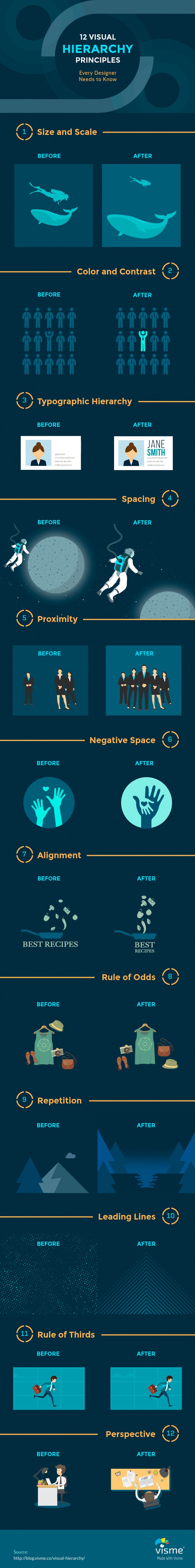
Many of these are taken from the Gestalt principles we all learned in some sort of design 101 class (and there were less than 12). From what I learned in school, numbers 4 and 5 (spacing and proximity) are pretty much different aspects of the same core principle, but when applied to visual hierarchy there is a bit of a difference (check it out the difference in the Visme article). And be careful as the spacing example also uses size and scale so it isn’t entirely relying on a single principle. But nonetheless, it is an excellent tool for keeping tabs on these core principles.
Yesterday’s post dealt with the different terms client use to describe the visual logo style they are after. Today’s chart can be used as a companion piece. The same way that a logo has a different feel if it is classic or modern, certain core design principles can be used to emphasize key brand principles. For example, you can plot repetition on a linear axis with random on one end and gridded on the other. From a brand perspective those two are polar opposites.
A more dependable company is more likely to use the core principle of repetition in a very organized manner (gridded). But a more agile and fragmented business might slide down the scale toward random.
Next time you start to lay out a graphic or design an experience, think about how these core principles relate to the client’s brand and how they can be used as organizing principles for the layout of the space and the customer journey.
via Digital Synopsis

Leave a comment